'Color Cast' is a term that generally means which way the colors in your image lean as a whole.
The best way to identify the Color Cast is to find a spot on the image that is supposed to be white or gray, and click on it with the EyeDropper tool.
 Step One:
Make sure your Color Panel is showing!
This panel lets you see the numerical values of the Color Cast that we want to adjust or modify.
Step Two:
 Select the EyeDropper tool from the menu bar!
Another way to select it is the keyboard shortcut 'i'.
Also, it is usually a good idea to
 increase the selection size that the EyeDropper samples from, which you can do by going up to the options bar in the upper left of the screen, as depicted here. A good size is 5 by 5, which selects a total of 25 pixels.
 Step Three:
Click on something that is supposed to be white/grey.
A good thing to click on would be teeth or perhaps a wall in the background. Even a cloud will work! But always try to find something with a High Saturation Value, this will help you get the best results, so click around and compare values of different whites and grays.
Here we can see in this example that when clicking on the teeth, the color panel shifts visibly to a white color that is selected within a green value, so we know that our Color Cast leans towards a green color.
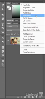
 If you would like to be more precise with your color values, you can click on the fly-out menu at the top right color of the color panel and select HSB Sliders from the drop-down menu, which will give you numerical values of selected colors (or a more readable version of the color cast).
Below is pictured a wheel of colors that you can use to identify what color values are shown in the HSB Slider box, in case you choose to work that way.
Step Four:
Auto Tone and Auto Color.
The saturation value [the S in the color sliders depicted above] is the best indicator of the Color Cast of the image you are working on. It tells us how 'intense' the color cast is. The lower the Saturation value of a neutral element [the white or gray areas of the image] the better, because it means that we have a less intense Color Cast.

 A few ways to reduce the color cast, which will show to be working by also reducing the saturation value as mentioned above, is to use Auto Tone and/or Auto Color. These are found in the Image Menu Bar at the top of the screen.
Choosing either of these will change the color cast of your image drastically, so make sure to check out each one and choose whatever you think looks best.
If Auto Tone and Auto Color Just Doesn't Do the Trick...
 Step Five: The Color Balance Command.
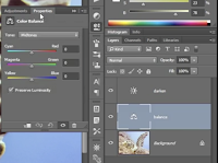
To add a Color Balance adjustment layer, click on the black and white circle at the bottom of the Layers Panel and choose Color Balance.
What should come up is layer with the following slider bars. [I named my layer 'balance', but you can name it whatever you want!]

According to your color cast, move the sliders away from that color, i.e. if your color cast is green, move it away from green. By doing this you will be leaching certain colors out of the picture, which will balance the overall look of the image.
I encourage messing with the sliders until the image is as crystal clear or color-dyed you want it to look.
Optional Steps: The Preserve Luminosity check box and Tone Control.
If you want to darken it, uncheck the box.
Another thing you can do to is operate changes while in certain areas of the Tone Control.
So, it the Tone Control box is set to Midtowns, any changes you make in the sliders below it will effect only the midtowns of the image. Respectively, switching over to Shadows lets you operate only on the shadows of the image, the same being for Highlights and so forth.


Comments
Post a Comment